Grid & breakpoints
Early on when redesigning the website we selected Gridset for our grid framework. At that date gridset was offering a wealth of options and customizations. The breakpoints were based on and informed by the main navigation with the main aim to keep as much of the navigation entirely visible as much as possible.
At a later date the team explored how easy it would be to change from Gridset to Bourbon Neat for a lighter, more flexible and more semantic grid framework. We soon concluded that the trade off in development time was simply too large.
Desktop grid
The desktop grid is 16 columns and spans 960px to 1280px.

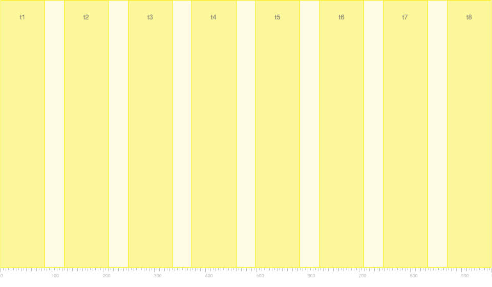
Tablet grid
The tablet grid is 8 columns and spans 600px to 959px.
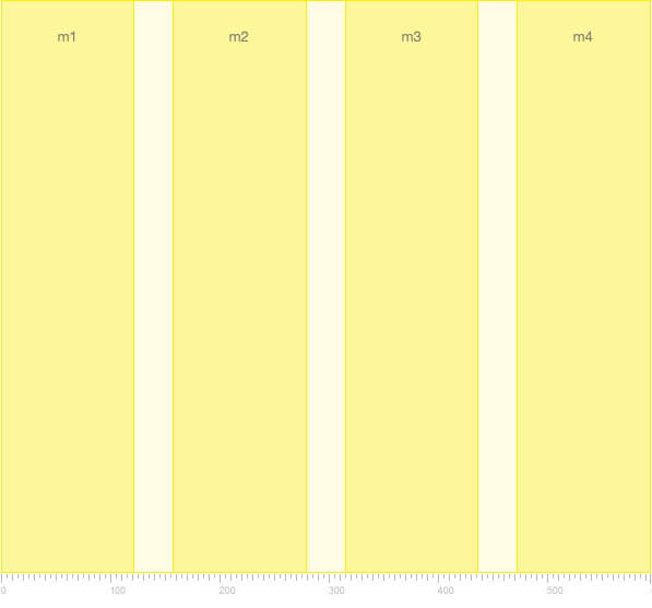
Mobile grid
The mobile grid is 4 columns and spans 320px to 599px.
Baseline grid
The baseline grid was established at 6px intervals and informed the vertical rhythm.