The Migrant Family Support tool purpose is to show where migrant families can get help with housing and financial support when they have no recourse to public funds (NRPF).
The tool is primarily aimed at people needing help, advisers, or local authority practitioners considering an application for social services support in the United Kingdom.
It is designed as a series of multiple choice questions which at the end offer advice on whether a person can claim benefits and social housing, get help from social services, or seek more personalised immigration advice.
The tool has been awarded joint Research Champion at the 2017 Community Integration Awards for its role as a "useful and timely toolkit [that helps] to support agencies, grassroots organisations and local authorities to access accurate information about the most marginalised and vulnerable".
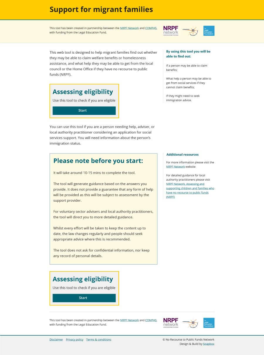
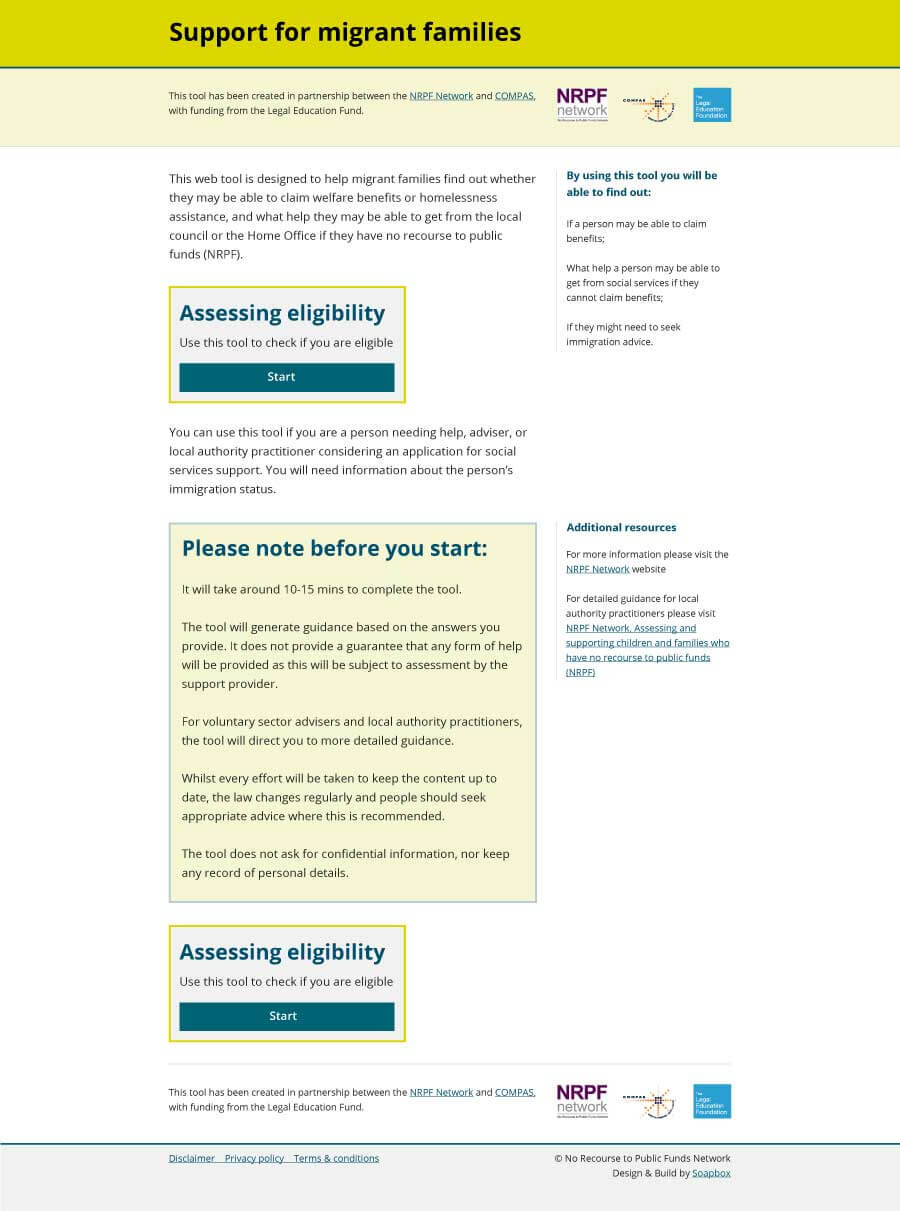
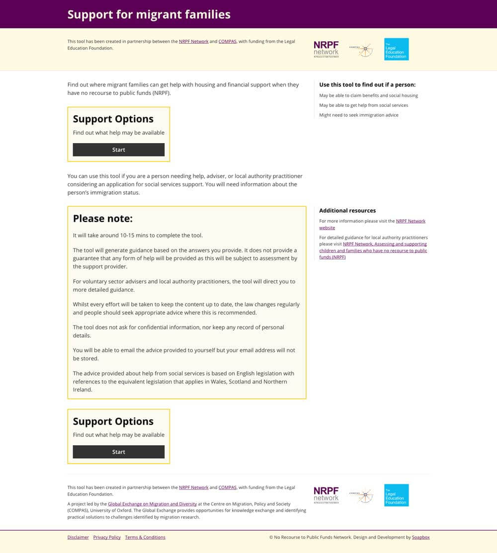
The first screen, before the user starts the tool, contains quite a lot of explanatory text to make it clear who should use the tool and how they will benefit.
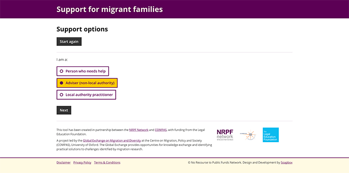
As soon as the tool gets started, the user is presented with 3 distinct paths based on target audience.
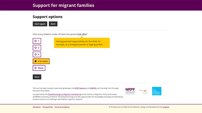
Any term or language which can be misinterpreted has a tooltip functionality with more explanation text.
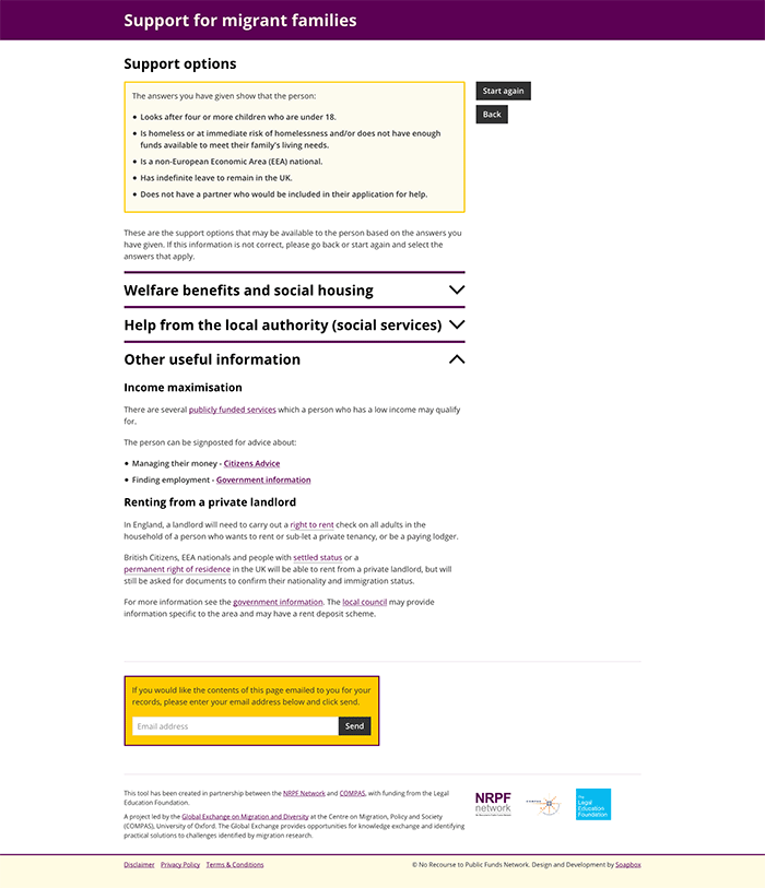
The final page of the user journey offers a summary of all selections so the user will have an overview of what the chose in the journey, advice on further steps, and a functionality to email the results to their email account.
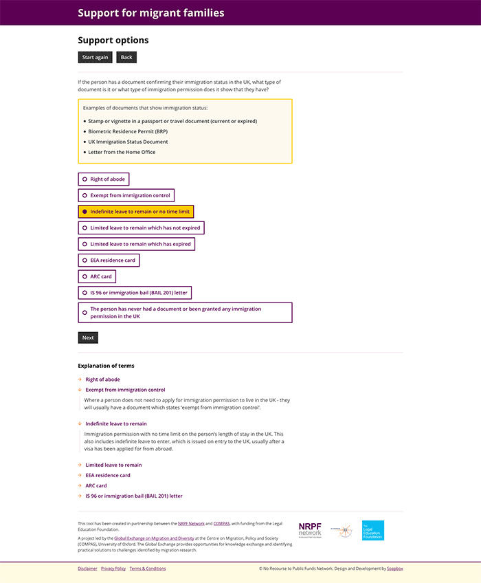
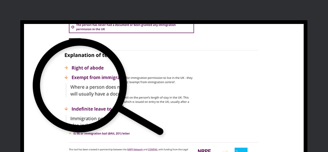
When any of the radio button labels require explanation or clarification, a glossary appears at the bottom of the page offering additional expandable text.
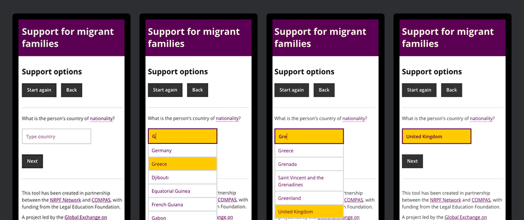
The country selector was a pattern that we dedicated some thinking time on. The normal, dropdown approach proved to be quite problematic with users, especially non-English speaking ones. Instead of the usual approach we opted for an alternative one - given that users already know the country they come from, they are presented with an input field. As soon as they start typing, a suggestion list appears matching the letters which narrows down as the users keep typing. The pattern also matches synonym terms, e.g. when a user type 'gr', United Kingdom is included in the list to cover the term 'Great Britain'.
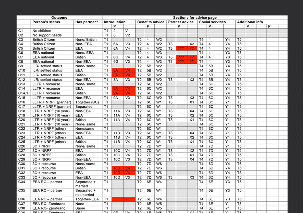
As the user flows are selection driven and due to the sheer number of paths, it became apparent from the very beginning of the project how complex the mapping of information and path selection would be. Instead of the normal way of depicting the structure and flows, we had to codify the content and map it in a spreadsheet.
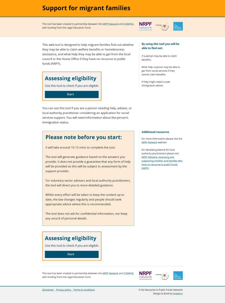
We designed a number of skins with different colour schemes which allow for differentiation when the tool is used more than once. All skins retain the same level of accessibility.
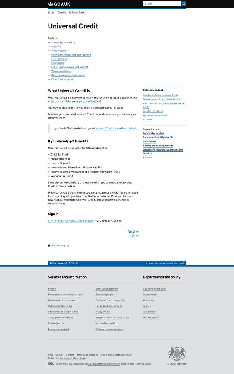
Early stage research indicated it was quite crucial in terms of user trust that the design and visual language of the tool did not deviate too much from official government portals while at the same time avoided being confused as a government site. This informed the design approach to a large extend.