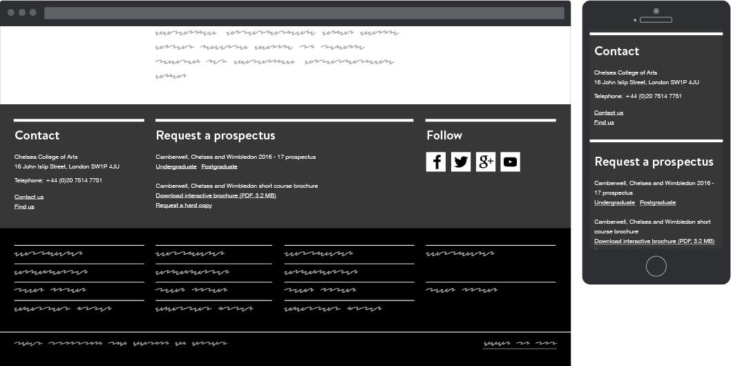
Main navigation
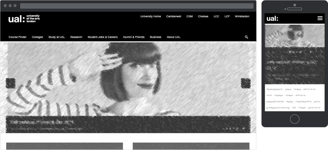
During the architecture drafting phase we identified a plethora of user groups. The user groups informed the global navigation structure, offering funnelled access to content and pages more relevant to them.
An extra layer of complexity was presented when the colleges asked for direct access to their sections from the global navigation. A business decision was taken to replace the non-hierarchical, user centric links planned to occupy the top right of the global header with direct links to the college landing pages.
Main navigation
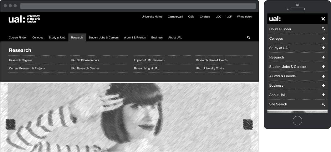
We opted for a click based navigation dropdown rather than a hover as user testing indicated this as the preferred approach.
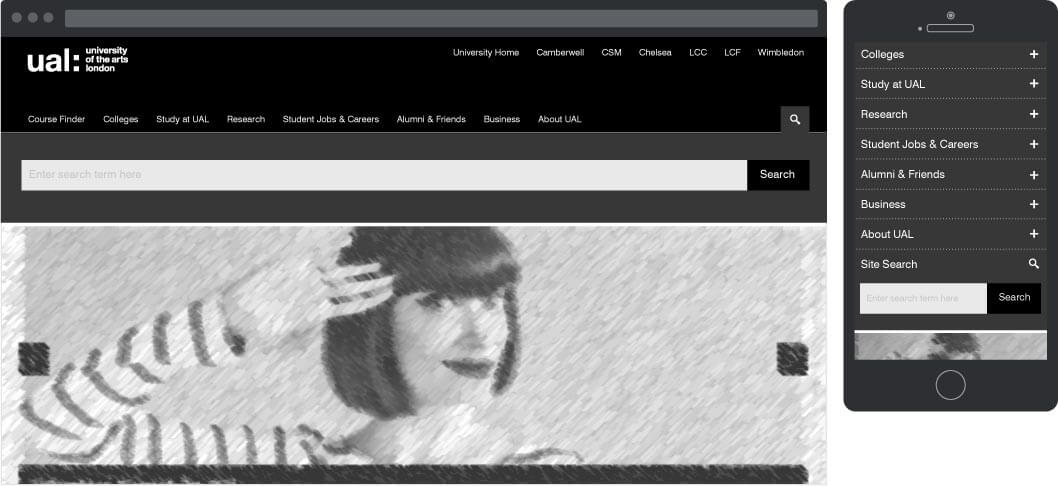
The search functionalities became part of the global navigation adopting the same functionality.
Menu breakdown
Logo
Main navigation
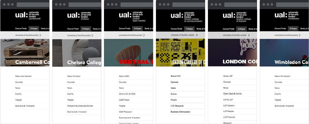
College sections

The logo issue
The brand mark, as Pentagram designed it, consisted of the main university logo and a number of lock-ups for the colleges. By unifying the college subdomains, we had to use all lock-ups in the site. User testing showed a number of users going directly to college landing pages who expected the college lock-ups to return them to those landing pages once deeper in those sections. This created a usability issue which prevented the use of the logo as a link to the main home page. We worked around this by creating a university 'Home' link as part of the quick links on the top right of the page.
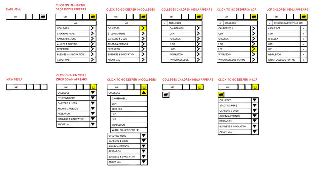
Mobile menu UX exploration
Two separate approaches were explored for mobile navigation which then informed the desktop approach as well:
Initially we wanted to make it as easy as possible for a user to be able to navigate the entire site from any page when on mobile. The aim of this approach was to mitigate the common mobile nav issue of lack of information scent: the user would be able to go deeper on sections by clicking a 'forward' button thus seeing what is housed under ever link with out committing on a page click.
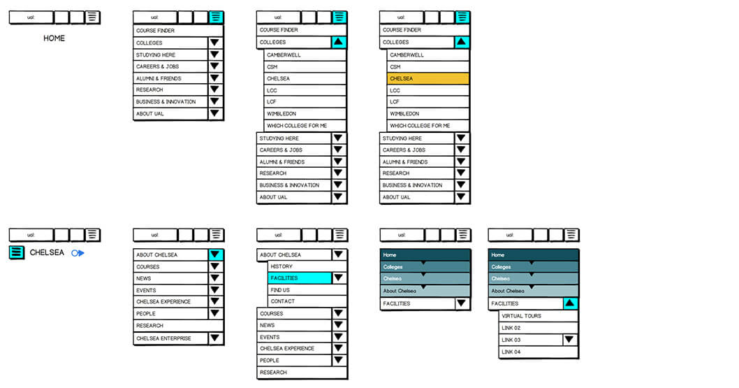
The second approach was a more conventional, step by step navigation. The user would be able to see the immediate children pages of the loaded one, and then select the next page from the available links.
After tests the first and preferred approach was discarded as to make it work we had to load the entire architecture on every page. This was increasing the page size and thus load times considerably and was exceeding the page performance budgets.
Breadcrumb & page title
Due to the complexity of the site and CMS restrictions, the breadcrumb was used as both place indicator in the architecture and core navigation for step retracing.
Breadcrumb & page title placement

Local Navigation
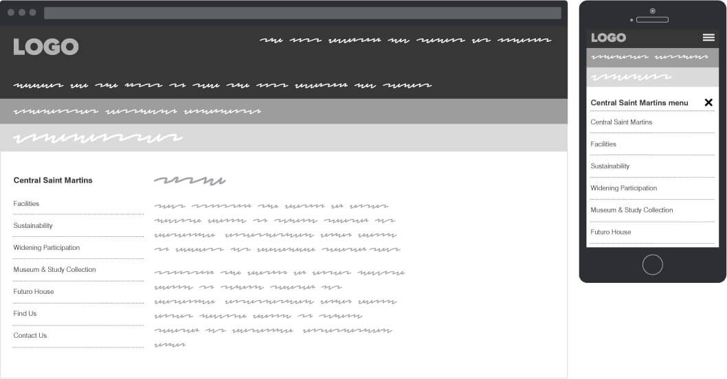
The linear, step by step mobile navigation approach informed the local navigation. Several different approaches such as Siblings+Children & Parents+Siblings+Children were tested but proved to be less effective when it came to sign posting and ease of navigation.
Local, secondary navigation placement
Footers
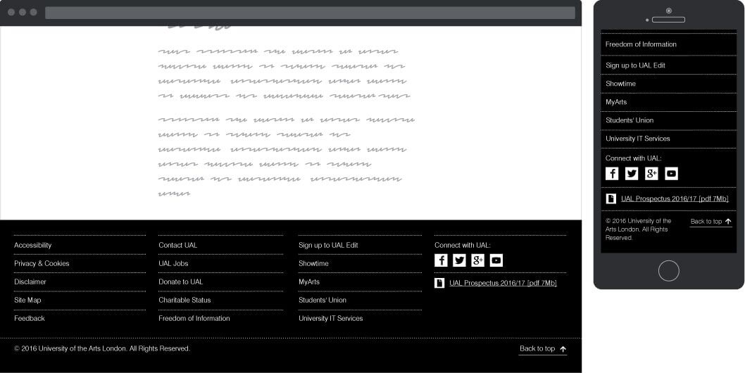
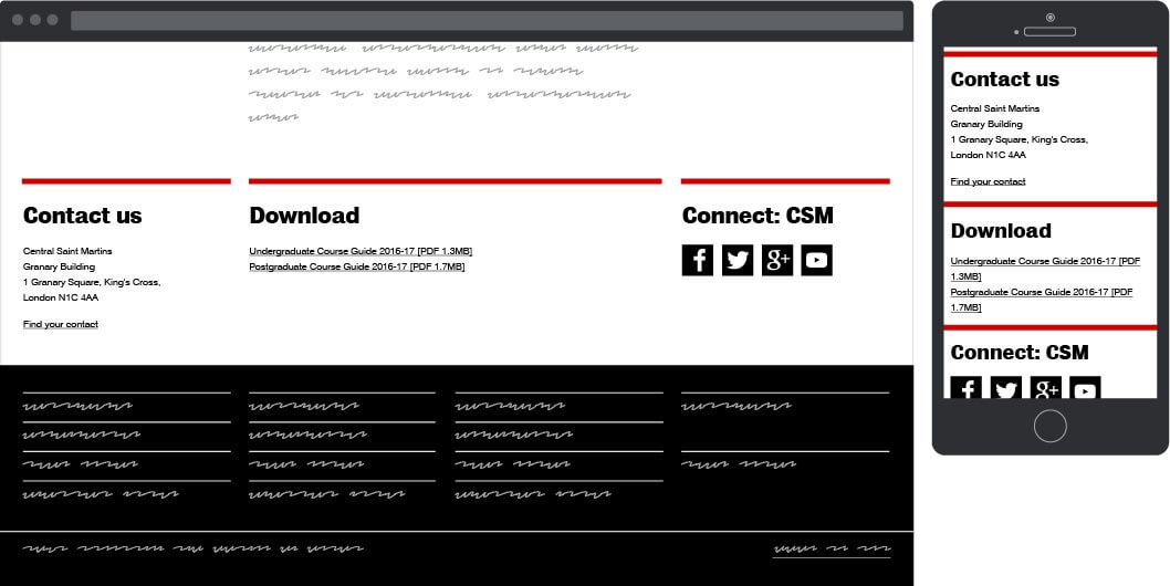
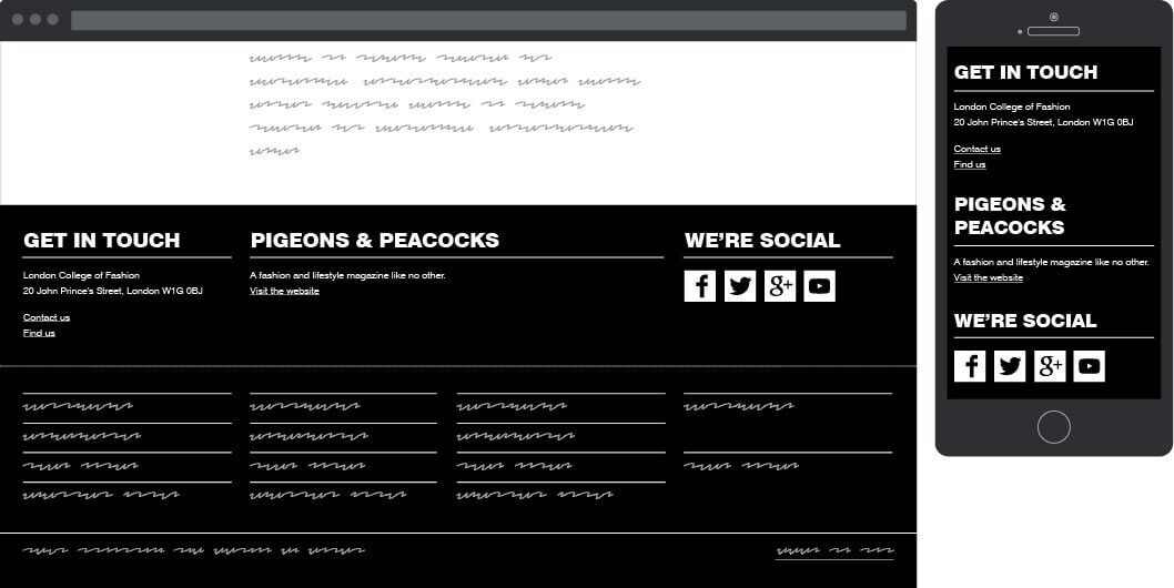
In addition to the global footer, 6 sub-footers where designed to offer more localised content.
Global footer
Central Saint Martins footer
London College of Fashion footer
London College of Communication footer

Camberwell, Chelsea, Wimbledon footer
