Typography
During the discovery phase of the website redevelopment project the colleges expressed strong preferences regarding typographic styles and directly linked styles to individual identities. After in-depth consultations we decided to use typography as one of the key differentiators to reflect the college identities.
Following the unconventional practice of using multiple typefaces within a single typographic system we had to ensure sizes, weights, line heights and spacing balanced on pages irrespective of the font pairing.
Further more the type flow on the page had to be harmonic with unobtrusive and natural spacing as the typographic scale and spacing were later used to inform the spacing of every single page element.
Global base font
The brand typeface, as set by Pentagram during the university re-branding exercise, is Helvetica Neue. Given that the Helvetica Neue font family has notable visual issues at certain sizes in digital media, we opted using Swiss 721 instead as a base font. Swiss is a digitised version of Helvetica which corrects any hinting issues cropping up on digital mediums, created by Bitstream (now part of Monotype).

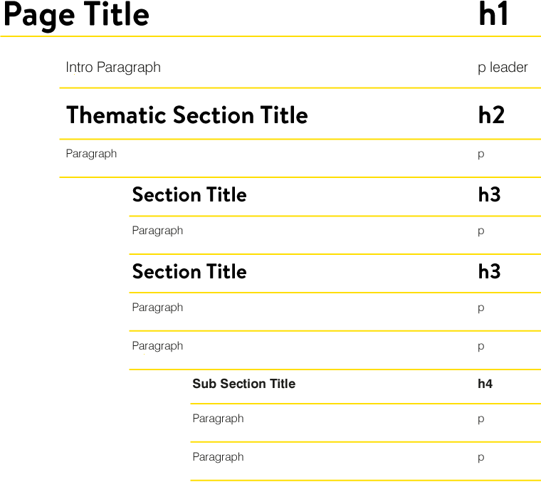
Typographic cascade

Typographic scale


Size reductions: original vs new
When the original typographic scale was conceived, the size variation was more generous to better indicate type hierarchy. It soon became apparent that the generous scale cascade was becoming a problem in semantic syntax.
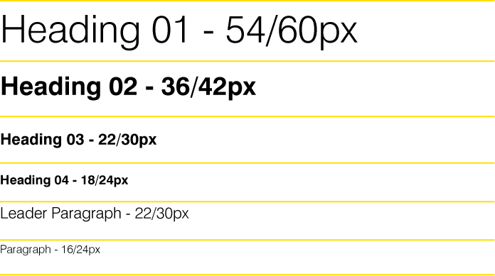
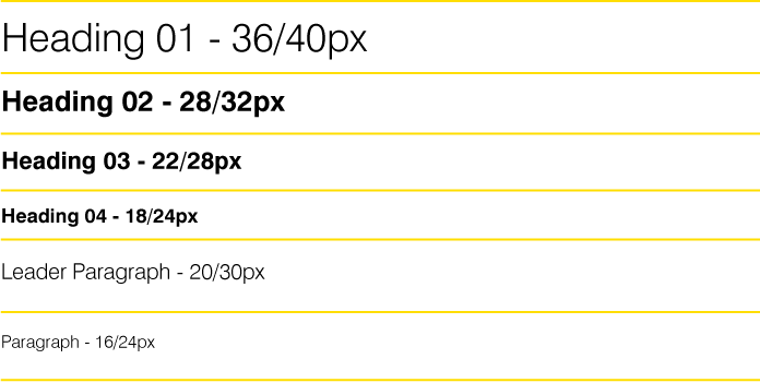
The original scale problem
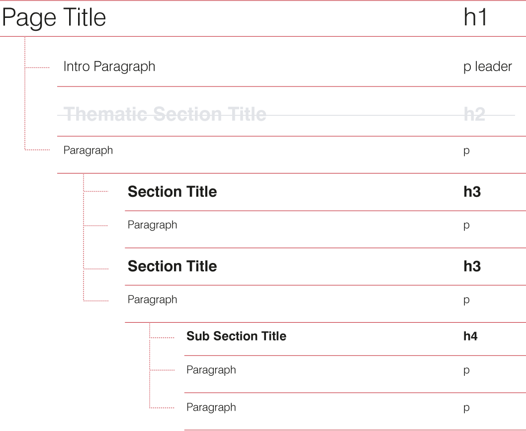
Due to the nature of the organization a semantic syntax was hard to enforce. The University has a plethora of content creators and editors who all have access to basic html editing in the CMS. When editors didn't 'agree' with the scale they would soon bypass H2s in preference of h5s. To solve the problem and ensure a semantic approach the scale got revised with smaller cascade variations.
Central Saint Martins typography
Central Saint Martins has a long typographic history and as such their views on typography were the strongest. The consultations included a number of academics such as Professor of Typography, Phil Baines.
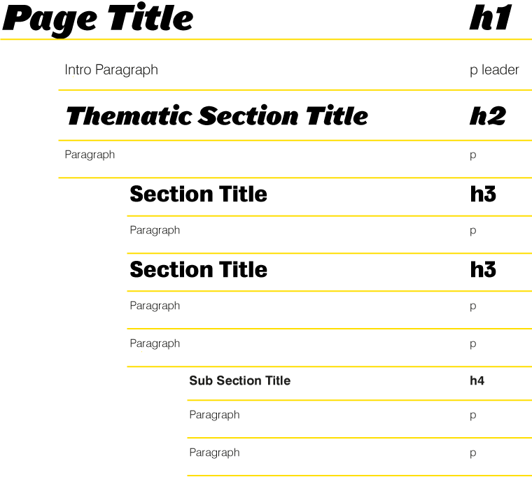
Central Saint Martins heading fonts
Extensive consultations with the College resulted in the use of 2 different grotesque heading fonts that were part of their print brand direction: Leviathan Black, created by Hoefler&Co. and Bureau Grotesque, created by Font Bureau.

Typographic cascade
London College of Fashion typography
The LCF section font selection was perhaps the most straightforward. The College has very strong image based content that allowed us not to rely heavily on typography for differentiation.
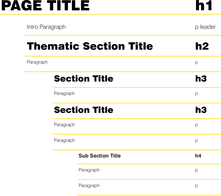
London College of Fashion heading font
An extra weight, Swiss Black, was added to the Swiss base font family which was reserved for the London College of Fashion section. Extra letter spacing was added through css to H1s to make them more readable as they were set in capitals.

Typographic cascade
London College of Communication typography
During the consultations a strong link between the College and communication media was established that formed the base for the heading font selection.
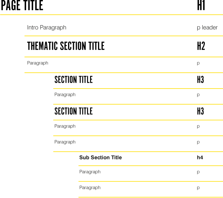
London College of Communication heading font
League Gothic was initially selected to represent the LCC section for its newspaper feel, but after several tests on different sizes it was shown to have hinting and line heights issues at smaller sizes rendering it somewhat unreadable. To minimise accessibility problems we opted for Alternate Gothic, a similar font which renders better on screen.

Typographic cascade
Camberwell, Chelsea & Wimbledon typography
The three colleges were approached as a single entity in regards to styles as they share quite a large part of their academic offering and have more cross section user journeys than the rest of the Colleges.
Camberwell, Chelsea & Wimbledon heading font
Brandon Text was selected to represent CCW as a softer font which complements the kind of creative work (and hence images) the Colleges produce. Brandon Text is a grotesque font by HVD.

Typographic cascade
