Buttons
When designing the buttons, we had to think carefully of styling; They had to be both style neutral as they needed to work well when placed in different styled sections and prominent at the same time.
The 'On' state was kept consistent through the entire site while the hover state acquired different colours in certain sections of the website.
Primary buttons, secondary buttons & interaction states

Calls to action
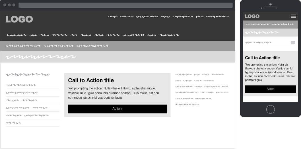
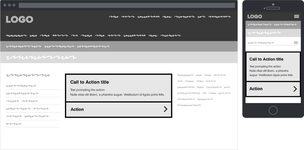
The calls to action were initially designed in the form of grey boxouts utilising the main button for performing the main action.
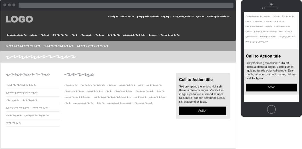
Main & aside call to action
The calls to action were initially designed in the form of grey boxouts utilising the main button for performing the main action.
Call to action sketches and notes
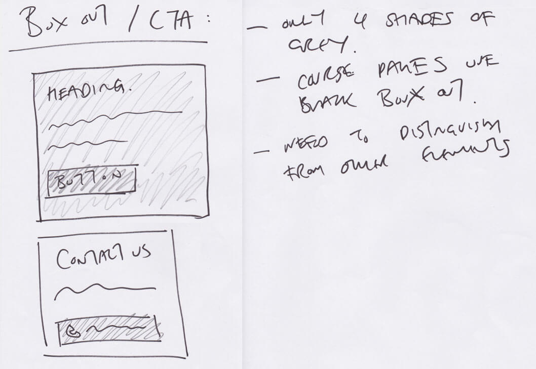
- Maximum four shades of grey to be used
- Course pages use black boxout
- Need to distinguish from other elements
Revised calls to action
Further user testing indicated a significant number of users were missing the call to action, especially in its aside placement, confusing it for regular content. Extra revisions were in line to differentiate it more from regular content.
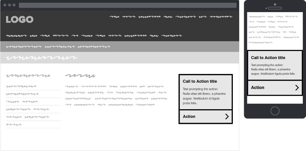
Revised CTA variations & interaction states
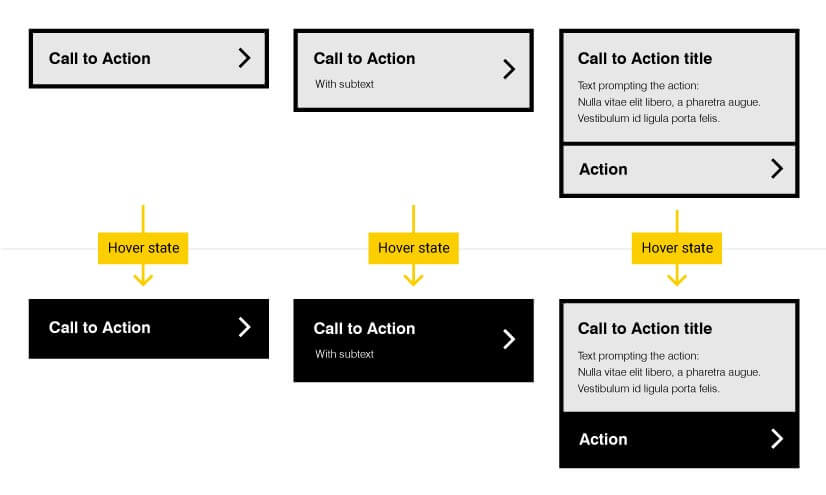
After going through the website content, 3 different variations of Calls to Action were designed to accommodate any content needs.
