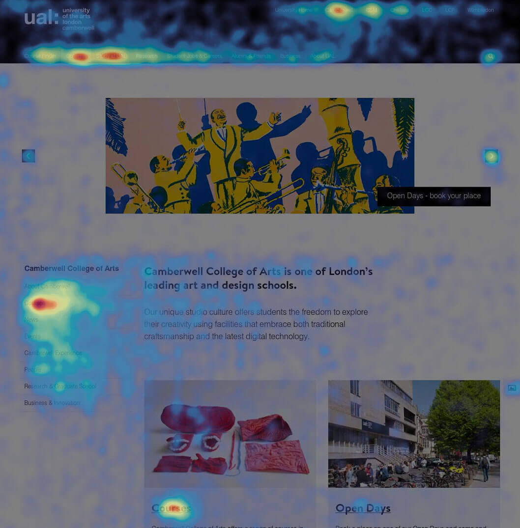
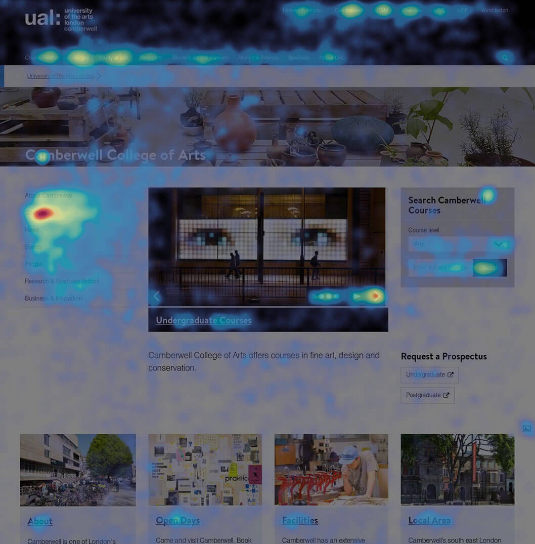
Camberwell, Chelsea & Wimbledon landing pages
When initially launching the unified UAL website, perhaps unavoidably, the page content structures were skewed towards business requirements rather than user needs. The need to convince 6 inter-competing colleges to come under an umbrella site led us to consult heavily with them on what types of content go where on the pages.
Following the landing page redesigns we closely monitored user behaviour to verify the success of the new layouts.
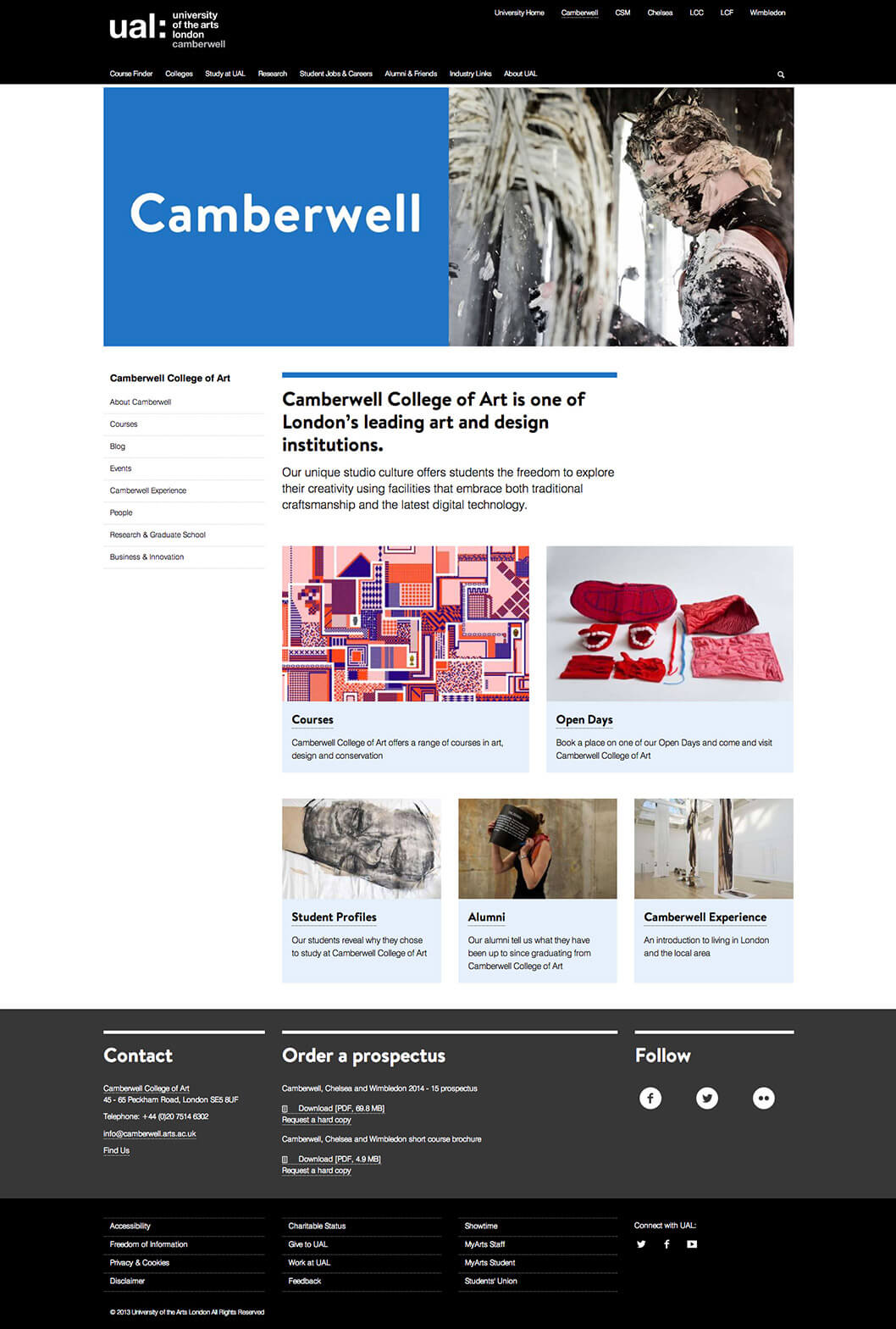
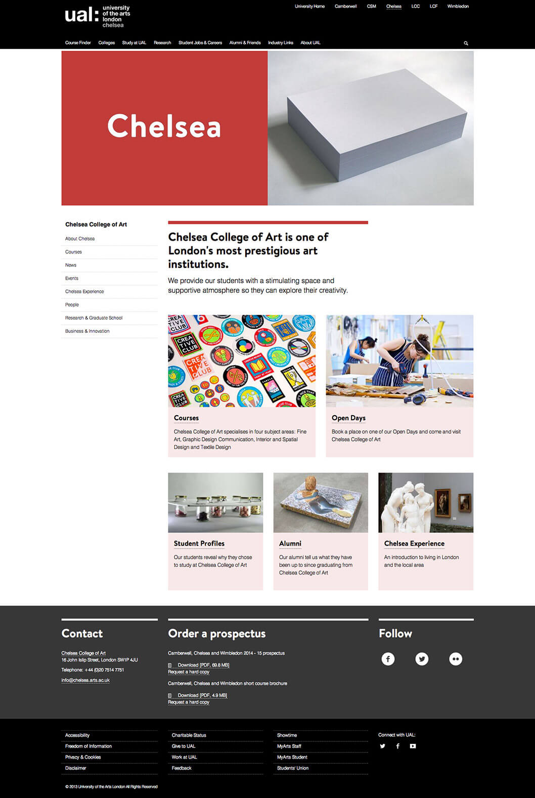
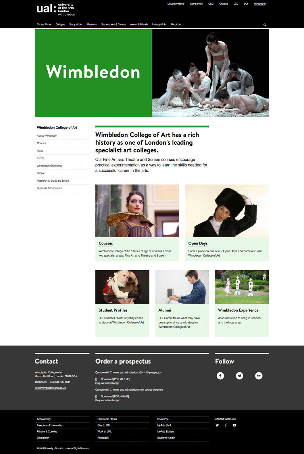
New landing page layout
The new landing pages were designed based on user data. Due to development resources limitations we had to limit the designs to modifications, and make use of existing system components and patterns rather than create brand new ones.

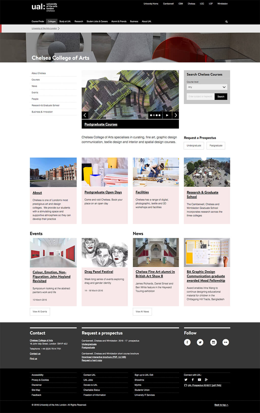
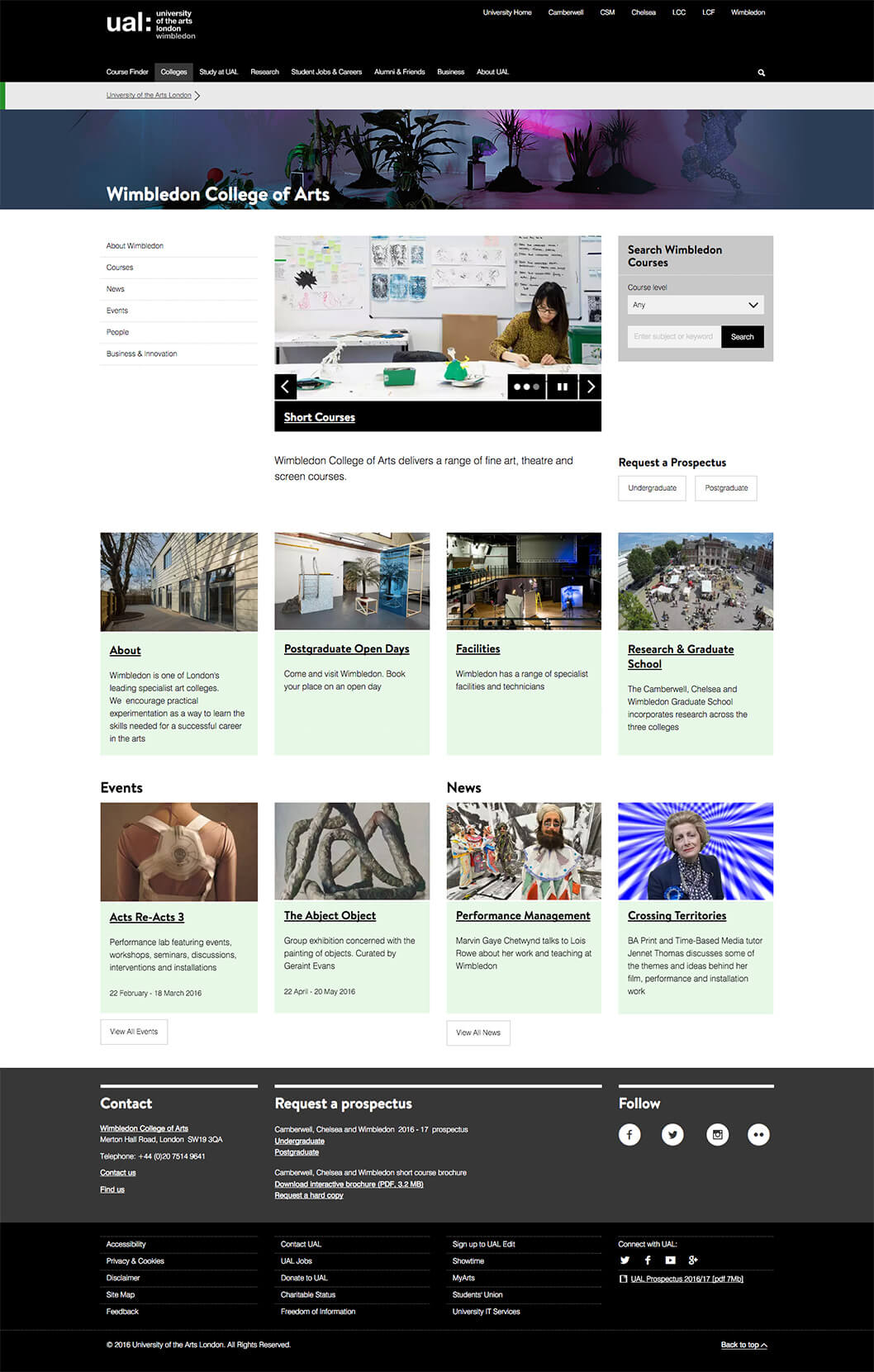
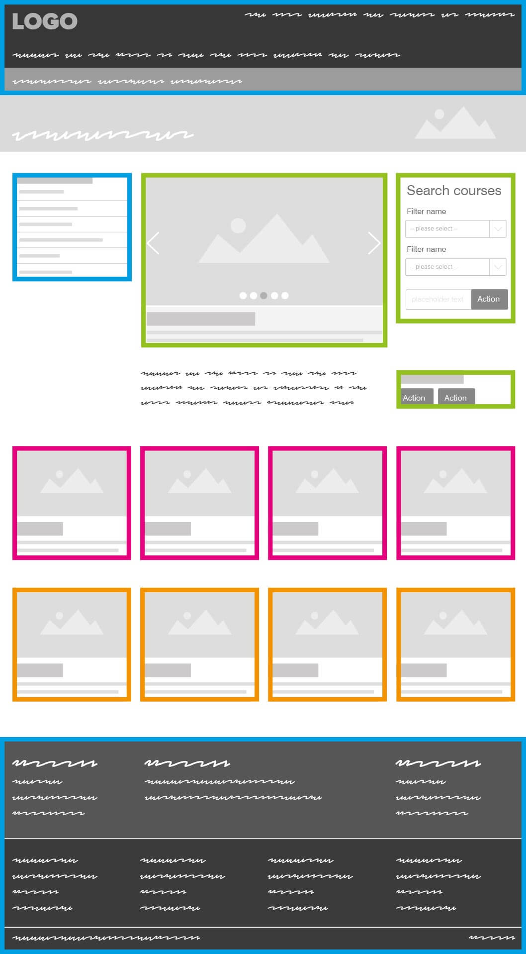
New landing page wireframe

Content structure
Navigation
Courses
Deep links
Promotional
Original landing page layout
Mouse movement: old vs new
