Budget transparency
As public spending on higher education has fallen and the fees have gone up in recent years, a business decision was taken to offer the university finance figures in a transparent, digestible and user friendly manner.
The decision to do so was primarily driven by the false public perception that the university is operating as a private company driven by profit and the need to explain the figures in a way which the student can understand and relate to.
Infographic data
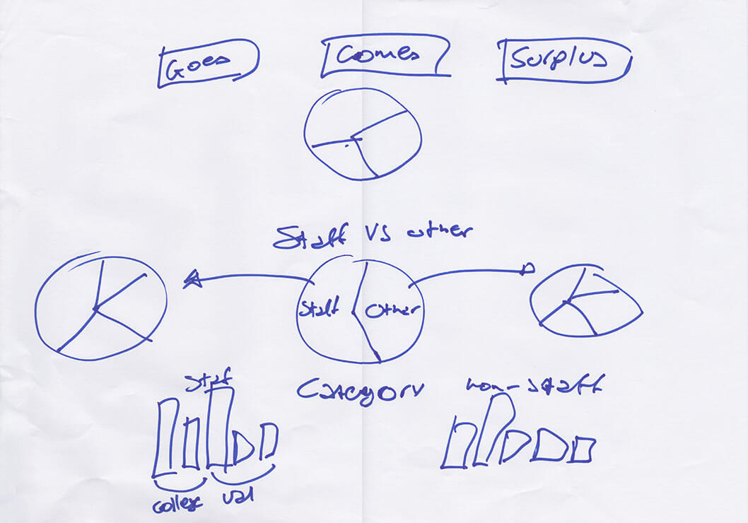
After collecting the raw figures from the finance department, it was up to the design team to categorise them in a way that can be translated visually.

Infographic sketches

Infographic design and interactions
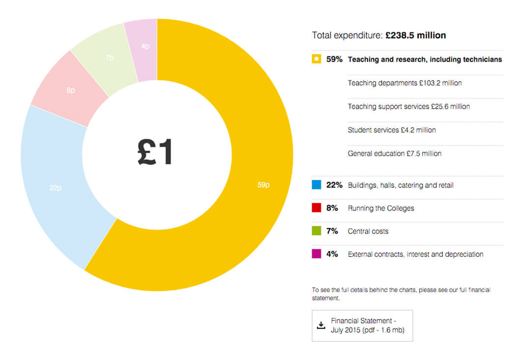
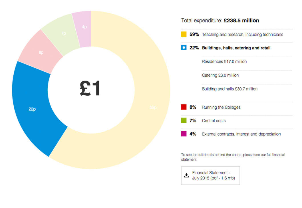
Page layout - early sketch

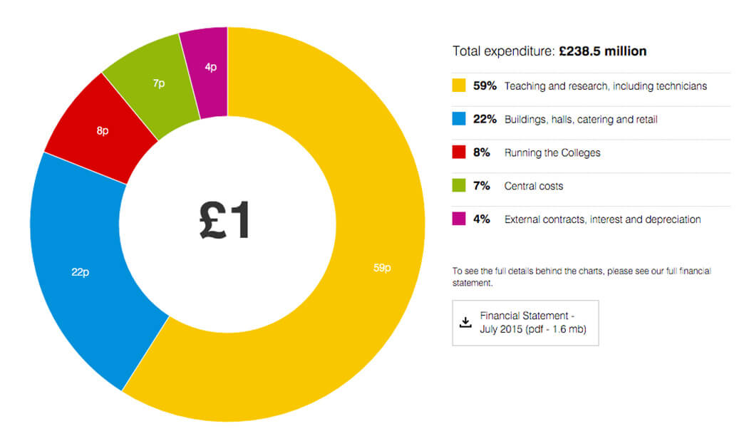
Page 01 layout - expenditure
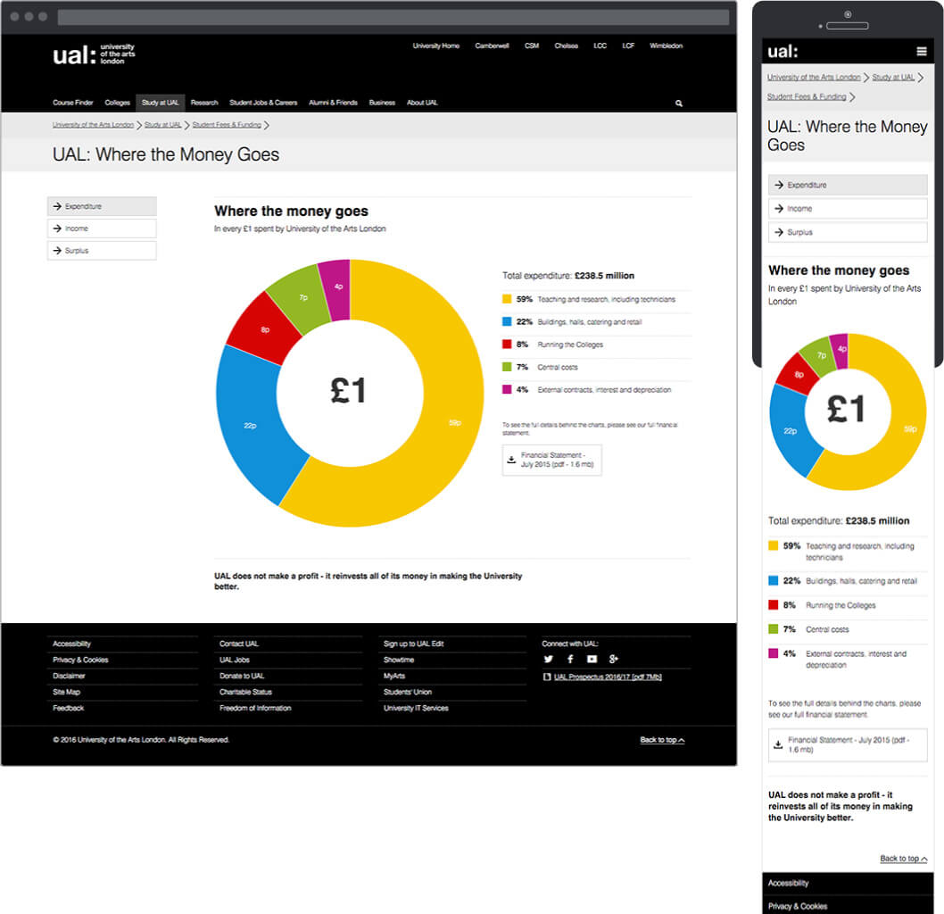
Page 02 layout - income
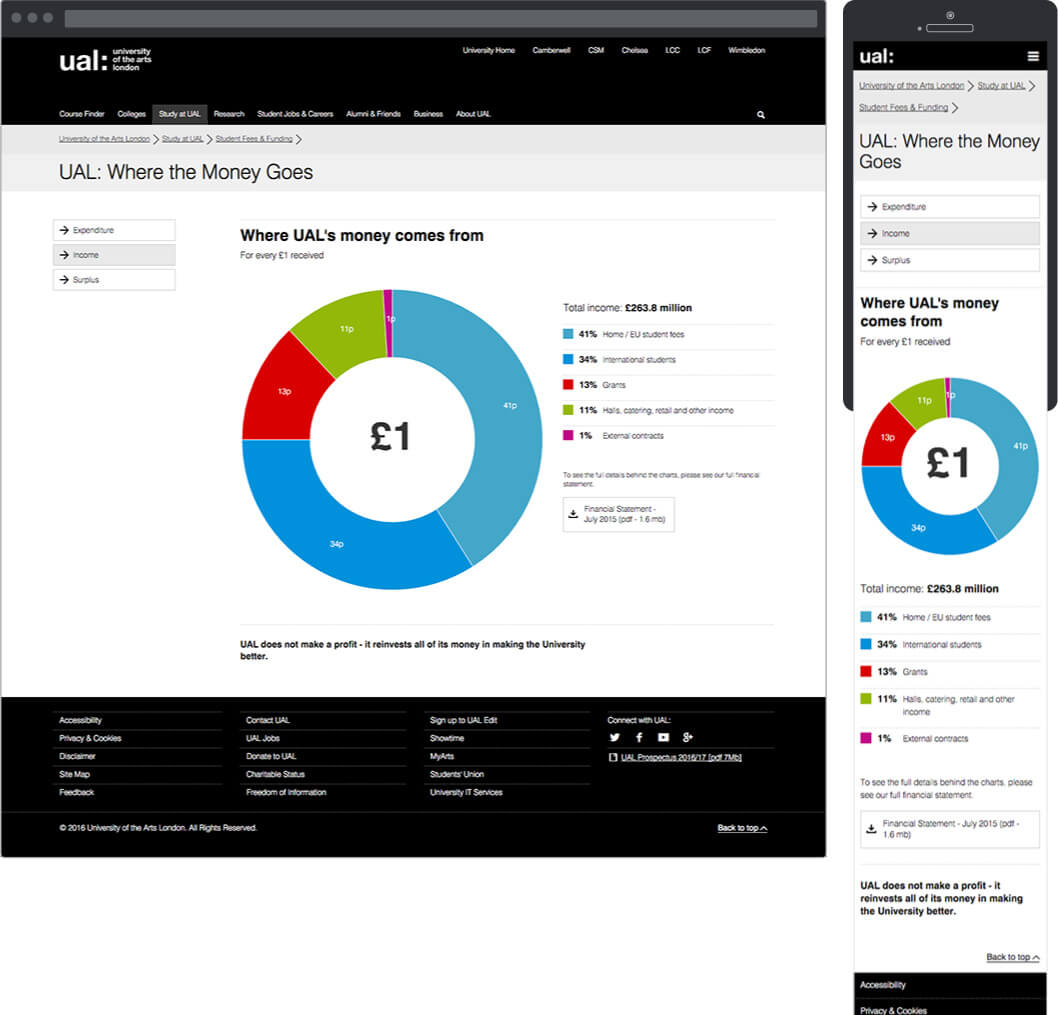
Surplus page icons
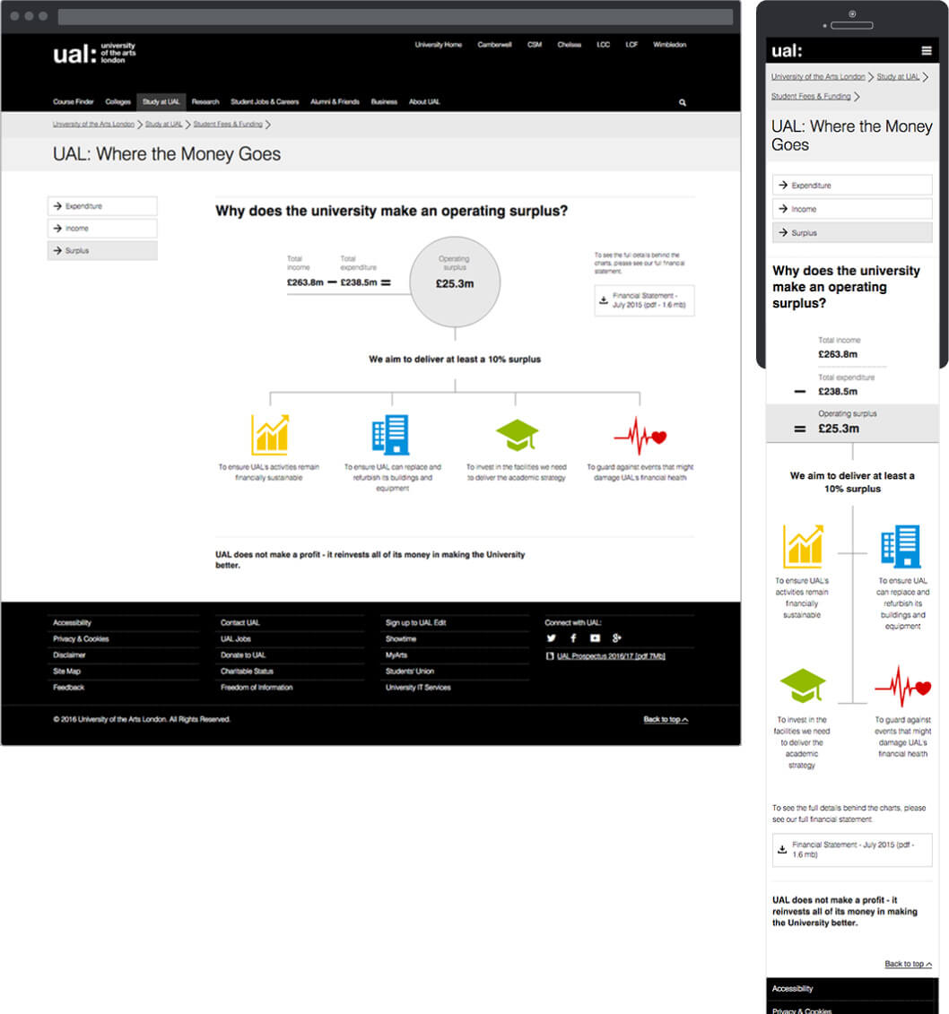
Page 03 layout - surplus
Surplus page alternative layouts
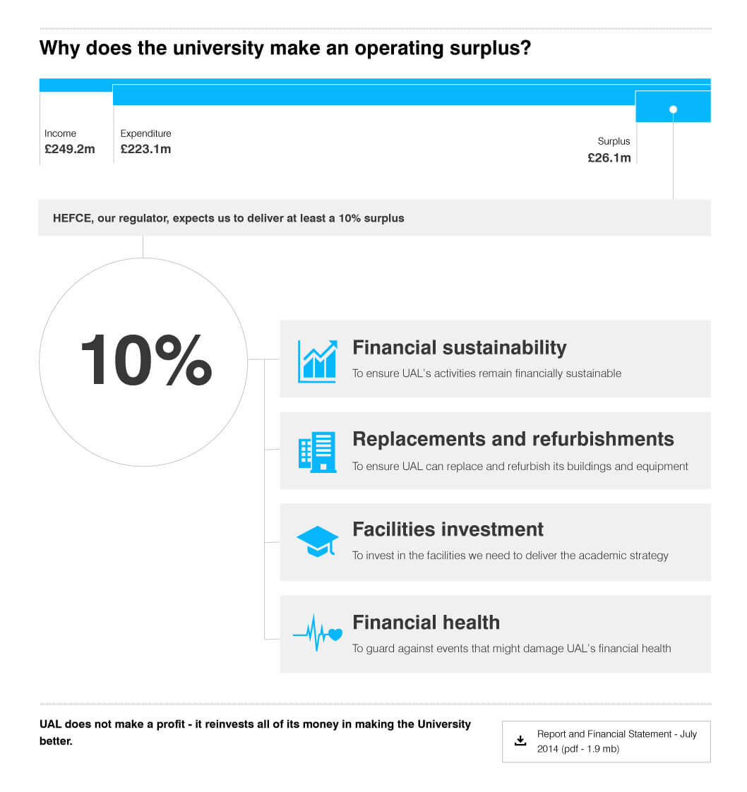
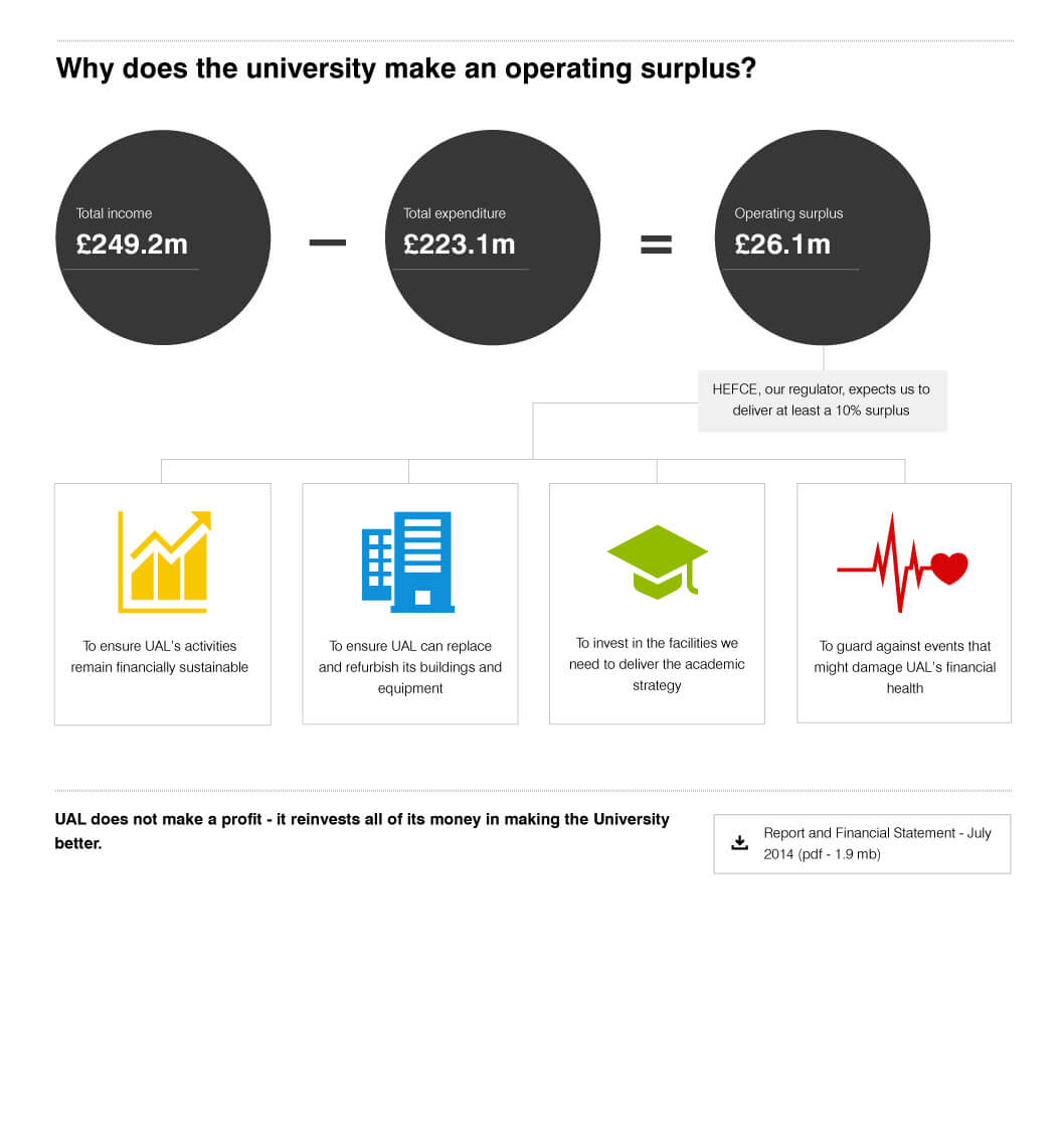
Two alternative layouts for the surplus page where designed with the first one emphasising the surplus percentage and the second one the actual figures.
Both approaches were rejected in favour for the approach with the emphasis on the surplus number.
